November 2024
November 2024
DOCQ
DOCQ
DOCQ
Role : UI/UX designer
Role : UI/UX designer
Tools:
Tools:


Problem Statement
Problem Statement
Problem Statement
Problem Statement
What is the problem?
What is the problem?
What is the problem?
What is the problem?
Booking a doctor’s appointment is often confusing, time-consuming, and inconvenient. Users still face long phone wait times, limited clarity on doctor availability, and complicated registration steps
Booking a doctor’s appointment is often confusing, time-consuming, and inconvenient. Users still face long phone wait times, limited clarity on doctor availability, and complicated registration steps
Booking a doctor’s appointment is often confusing, time-consuming, and inconvenient. Users still face long phone wait times, limited clarity on doctor availability, and complicated registration steps
Booking a doctor’s appointment is often confusing, time-consuming, and inconvenient. Users still face long phone wait times, limited clarity on doctor availability, and complicated registration steps
Why it is necessary?
Why it is necessary?
Why it is necessary?
Why it is necessary?
Accessing healthcare should be simple, not stressful. Improving this experience can help people get medical support faster and reduce missed or delayed appointments. With the growing use of smartphones, a streamlined digital solution can make booking faster and enhance the overall patient experience.
Accessing healthcare should be simple, not stressful. Improving this experience can help people get medical support faster and reduce missed or delayed appointments. With the growing use of smartphones, a streamlined digital solution can make booking faster and enhance the overall patient experience.
Accessing healthcare should be simple, not stressful. Improving this experience can help people get medical support faster and reduce missed or delayed appointments. With the growing use of smartphones, a streamlined digital solution can make booking faster and enhance the overall patient experience.
Accessing healthcare should be simple, not stressful. Improving this experience can help people get medical support faster and reduce missed or delayed appointments. With the growing use of smartphones, a streamlined digital solution can make booking faster and enhance the overall patient experience.
Who is the audience?
Who is the audience?
Who is the audience?
Who is the audience?
This solution is designed for everyday users from students and working professionals to older adults who want a quick, easy, and mobile-friendly way to book, reschedule, or manage their doctor appointments.
This solution is designed for everyday users from students and working professionals to older adults who want a quick, easy, and mobile-friendly way to book, reschedule, or manage their doctor appointments.
This solution is designed for everyday users from students and working professionals to older adults who want a quick, easy, and mobile-friendly way to book, reschedule, or manage their doctor appointments.
This solution is designed for everyday users from students and working professionals to older adults who want a quick, easy, and mobile-friendly way to book, reschedule, or manage their doctor appointments.


Goals
& Objectives
Goals
& Objectives
Goals
& Objectives
Goals
& Objectives
Booking a doctor’s appointment is often confusing, time-consuming, and inconvenient. Users still face long phone wait times, limited clarity on doctor availability, and complicated registration steps
Booking a doctor’s appointment is often confusing, time-consuming, and inconvenient. Users still face long phone wait times, limited clarity on doctor availability, and complicated registration steps
Booking a doctor’s appointment is often confusing, time-consuming, and inconvenient. Users still face long phone wait times, limited clarity on doctor availability, and complicated registration steps
Booking a doctor’s appointment is often confusing, time-consuming, and inconvenient. Users still face long phone wait times, limited clarity on doctor availability, and complicated registration steps
User Surveys and Interviews
User Surveys and Interviews
User Surveys and Interviews
User Surveys and Interviews

To better understand the real problems patients face when booking doctor appointments, I conducted surveys and informal interviews with individuals. Leveraging personal networks, university circles, I gathered insights that would shape the direction of the mobile app.
The survey was distributed digitally and focused on key themes such as booking preferences, common challenges, trust in digital healthcare. In addition to survey responses, I held short one-on-one conversations with a few participants to gather feedback and personal experiences.

Interview Questions
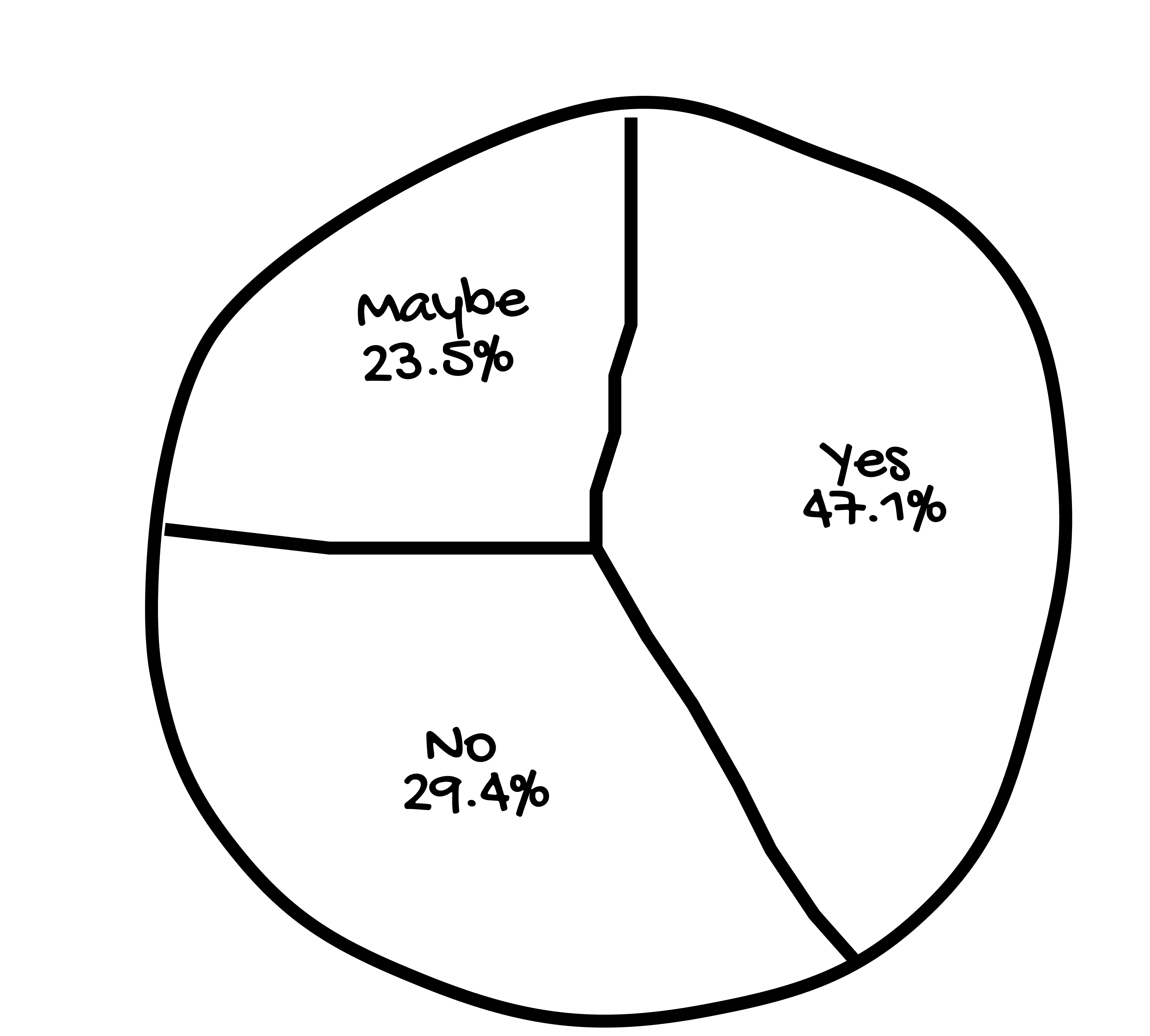
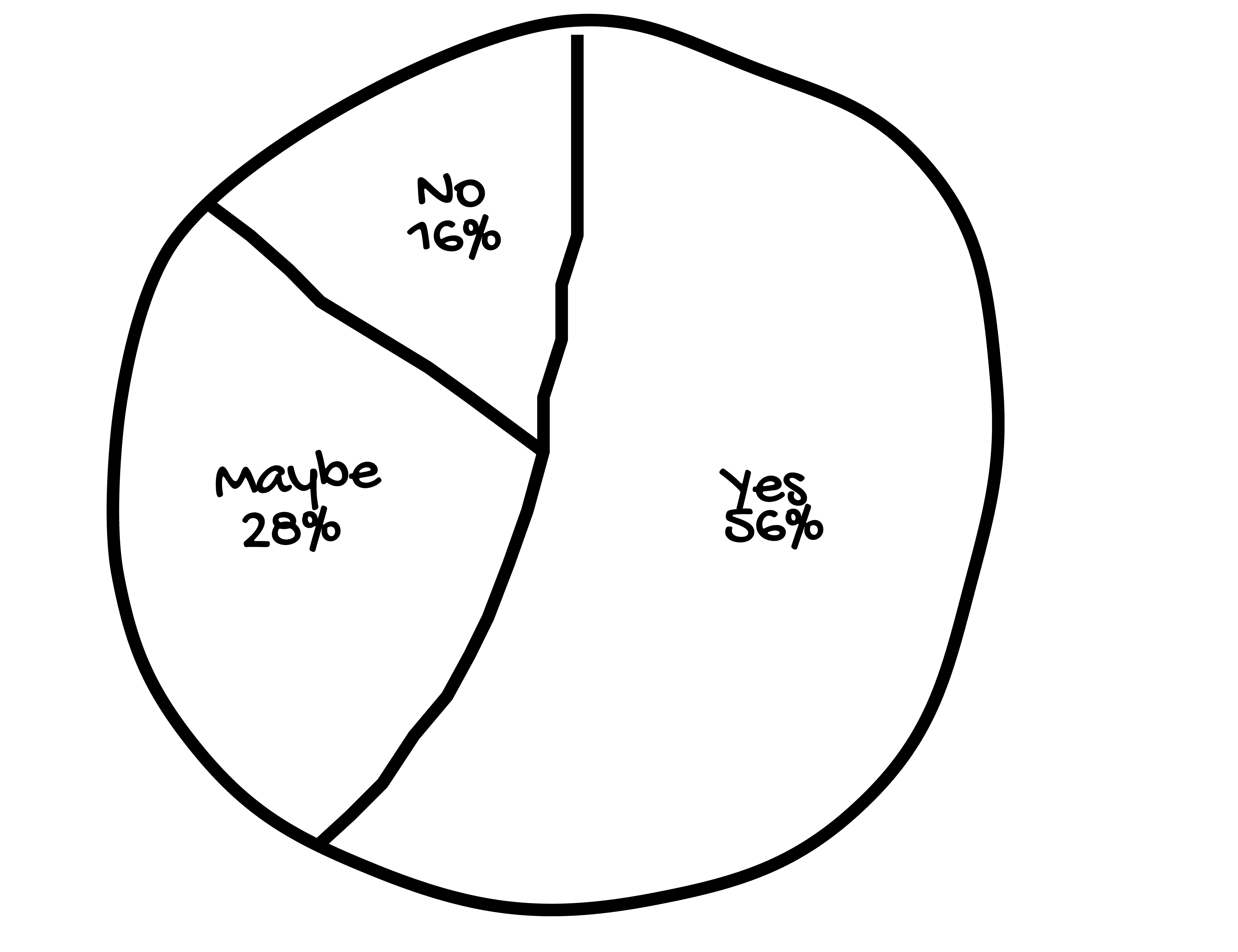
Q1. Would you prefer using a mobile app to book appointments ?
Q2. Would you trust an app to handle your personal health details?
Q3. How likely are you to use a mobile app instead of calling a clinic to book an appointment?
Q2. Would you trust an app to handle your personal health details?
Interview Questions
Q1. Would you prefer using a mobile app to book appointments ?
Q2. Would you trust an app to handle your personal health details?
Q3. How likely are you to use a mobile app instead of calling a clinic to book an appointment?
Q2. Would you trust an app to handle your personal health details?
Q1
Q1
Q1
Q1

Q2
Q2
Q2
Q2
Q2
Q2
Q2
Q2
Q3
Q3
Q3
Q3

User Surveys Learnings
User Surveys Learnings
User Surveys Learnings
User Surveys Learnings
The survey responses revealed a clear shift in user preference towards digital booking methods, with most participants expressing frustration over traditional systems like phone calls or in-person walk-ins. Lack of real-time availability, confusion over insurance acceptance, and limited communication from clinics emerged as major pain points.
The survey responses revealed a clear shift in user preference towards digital booking methods, with most participants expressing frustration over traditional systems like phone calls or in-person walk-ins. Lack of real-time availability, confusion over insurance acceptance, and limited communication from clinics emerged as major pain points.
The survey responses revealed a clear shift in user preference towards digital booking methods, with most participants expressing frustration over traditional systems like phone calls or in-person walk-ins. Lack of real-time availability, confusion over insurance acceptance, and limited communication from clinics emerged as major pain points.
The survey responses revealed a clear shift in user preference towards digital booking methods, with most participants expressing frustration over traditional systems like phone calls or in-person walk-ins. Lack of real-time availability, confusion over insurance acceptance, and limited communication from clinics emerged as major pain points.
Affinity Mapping
Affinity Mapping
Affinity Mapping
Affinity Mapping
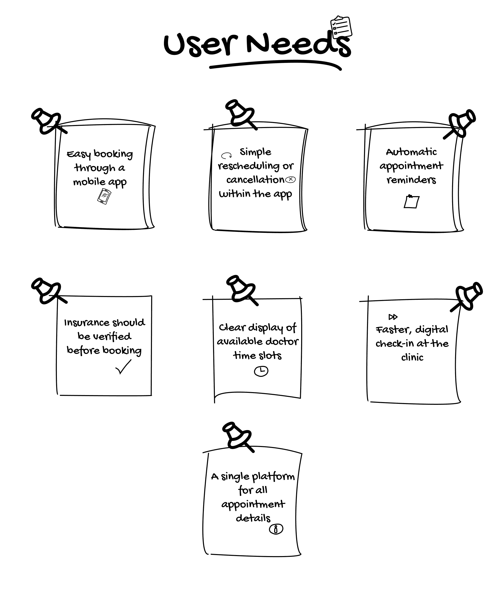
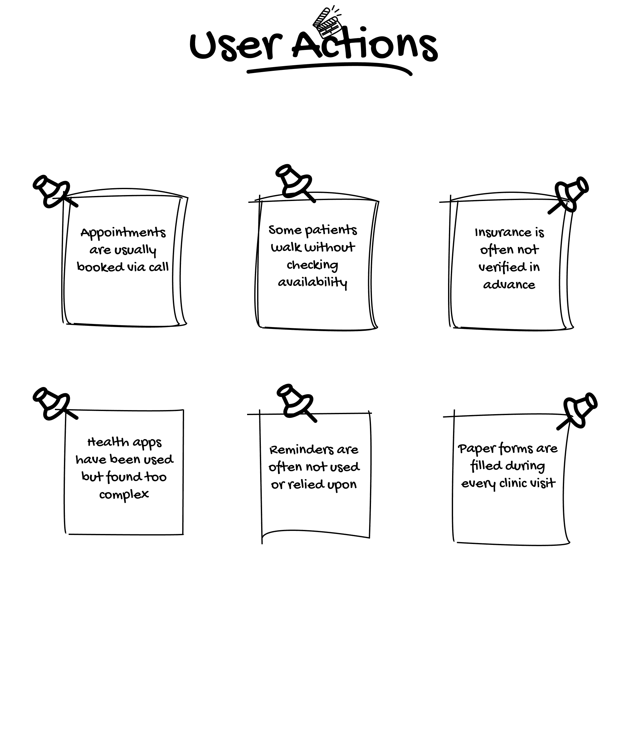
Following the survey and interview responses, I moved into the affinity mapping. This phase allowed me to dive deeper into the real experiences and expectations of users, helping me understand how they perceive features and processes within the healthcare booking system.
Affinity mapping helped me visualize and categorize the feedback into meaningful themes. I grouped the insights into Pain Points, Desires, and Current habits, which brought clarity to user frustrations, needs, and habits. This process was key in turning raw feedback into design decisions that truly reflect user behavior and simplify the overall experience.


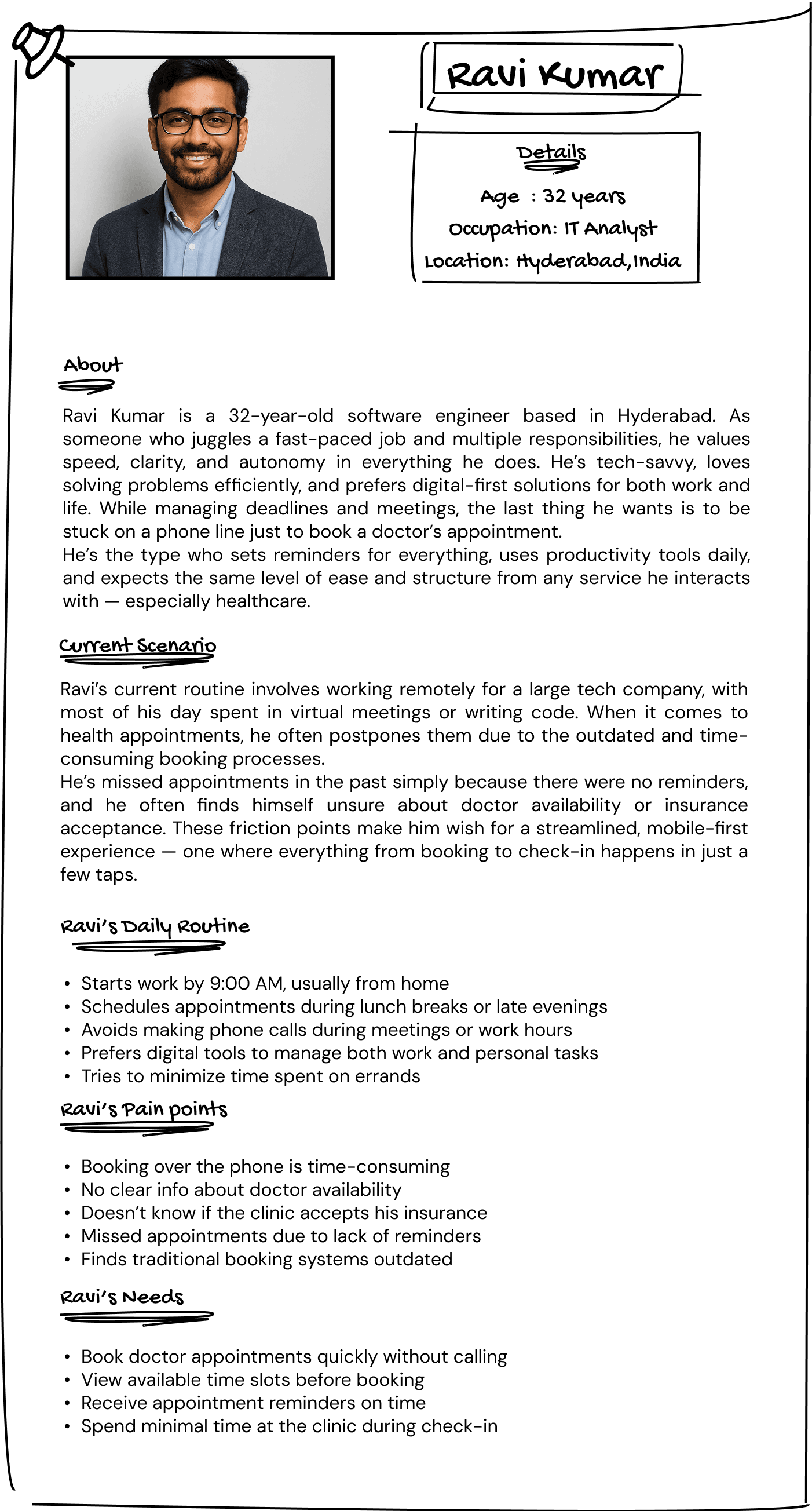
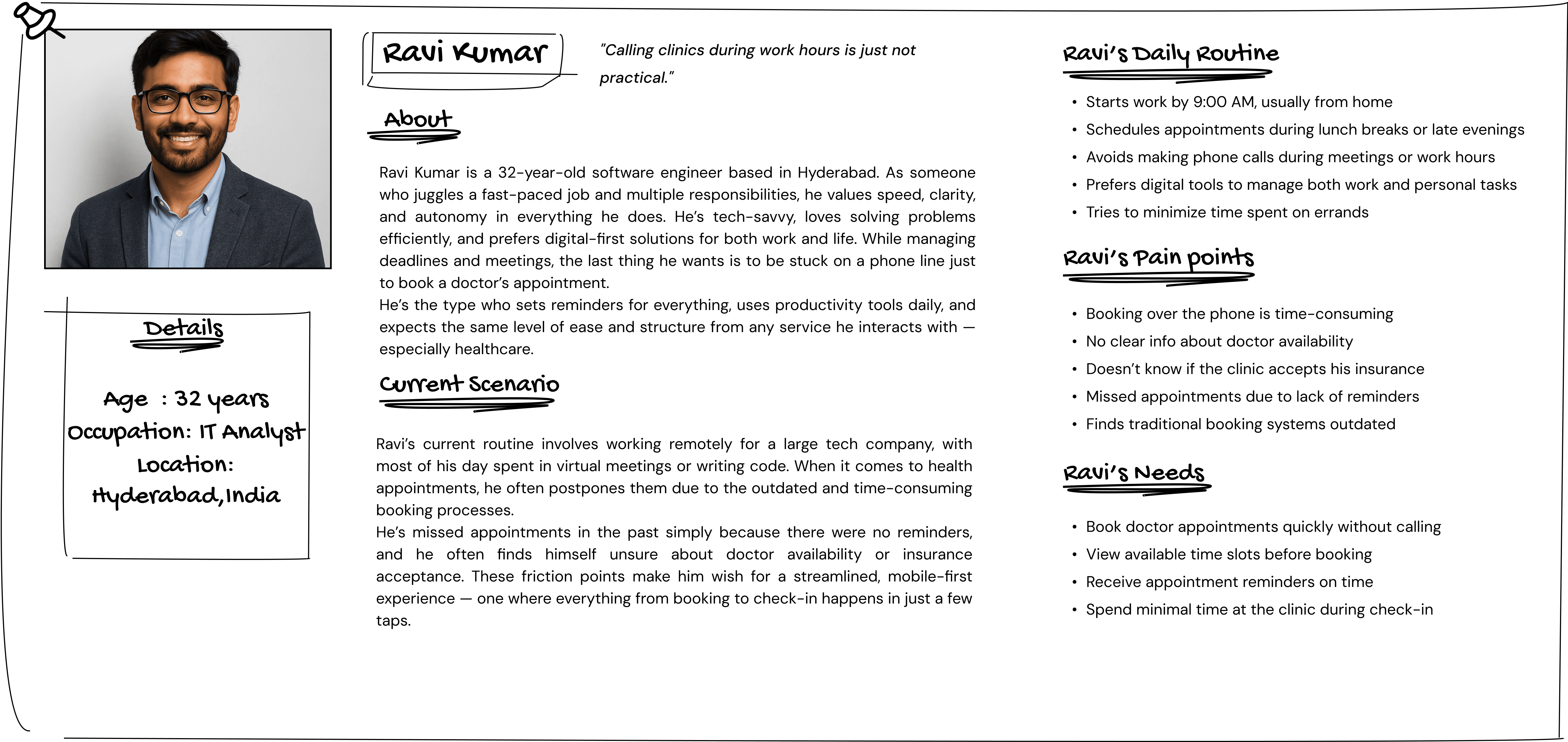
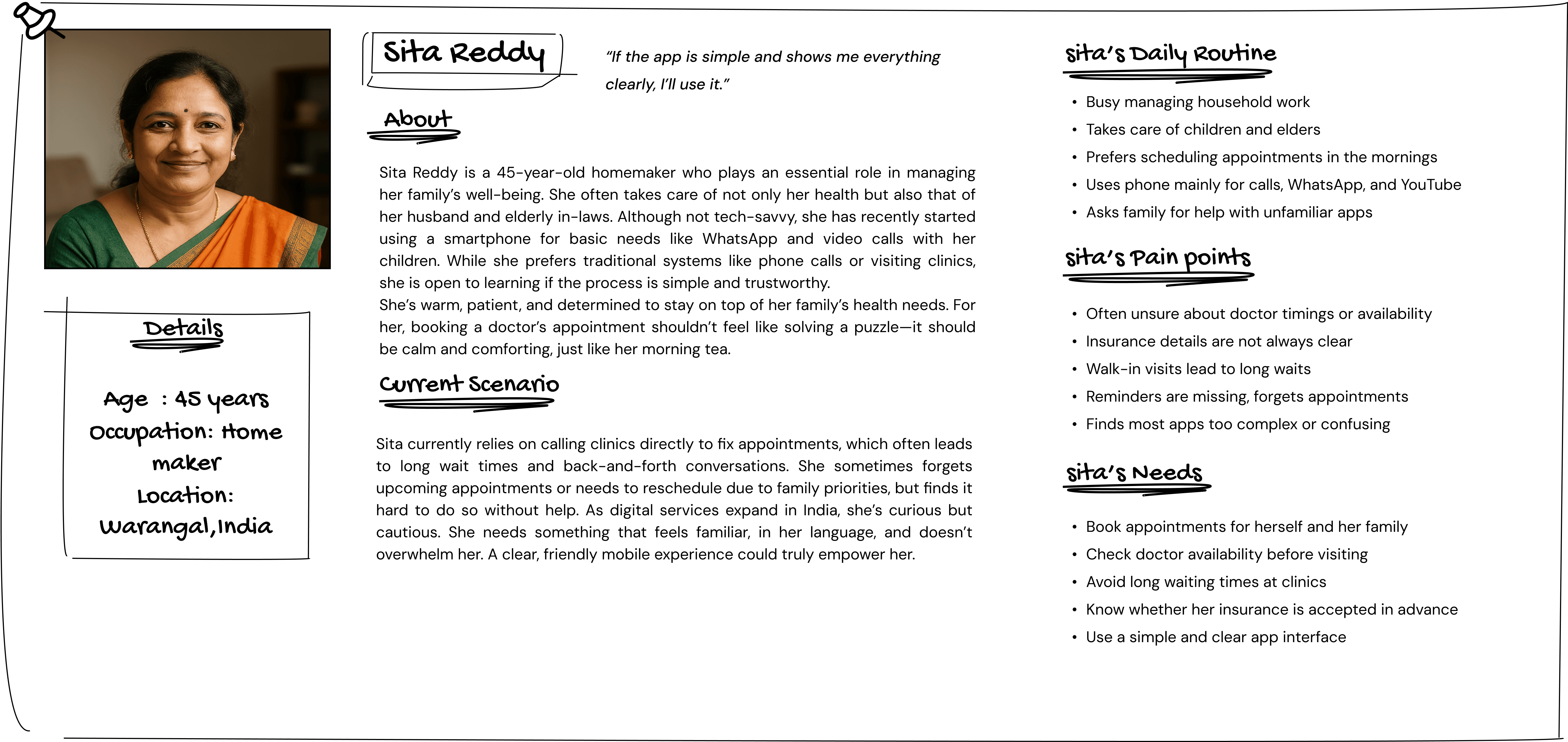
User Personas
User Personas
User Personas
User Personas
To better understand the people who would actually use this app, I created two user personas based on survey insights and informal interviews. These personas represent typical users with unique needs, daily routines, pain points, and goals.
By giving a face to the data, they helped guide every design decision from features to flow ensuring the app aligns with what real users actually want and struggle with.


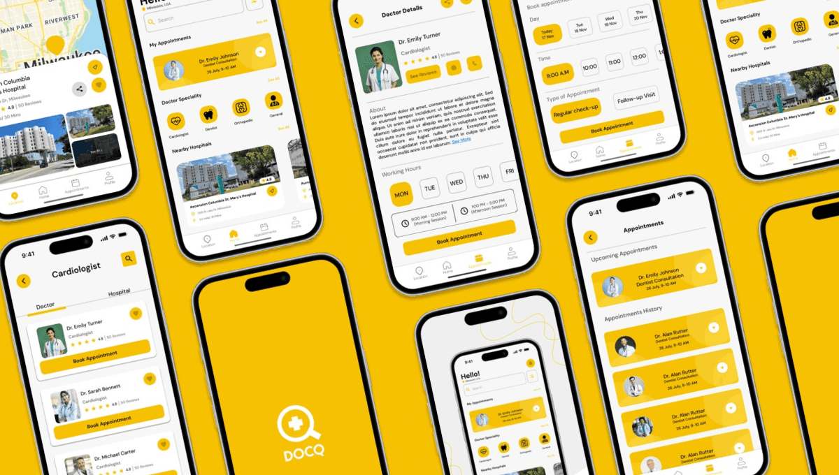
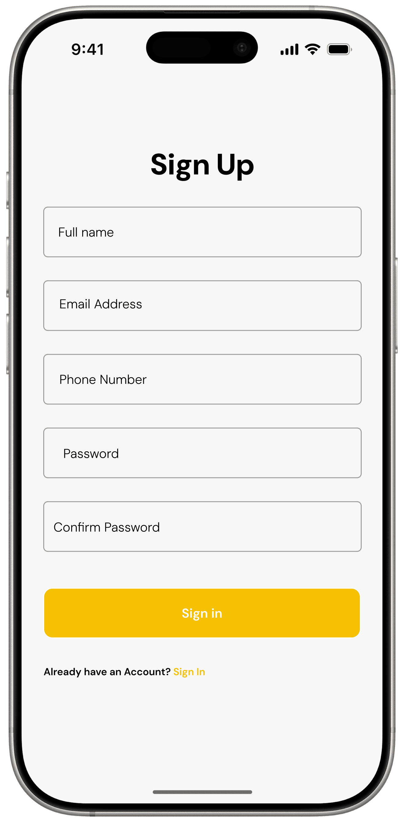
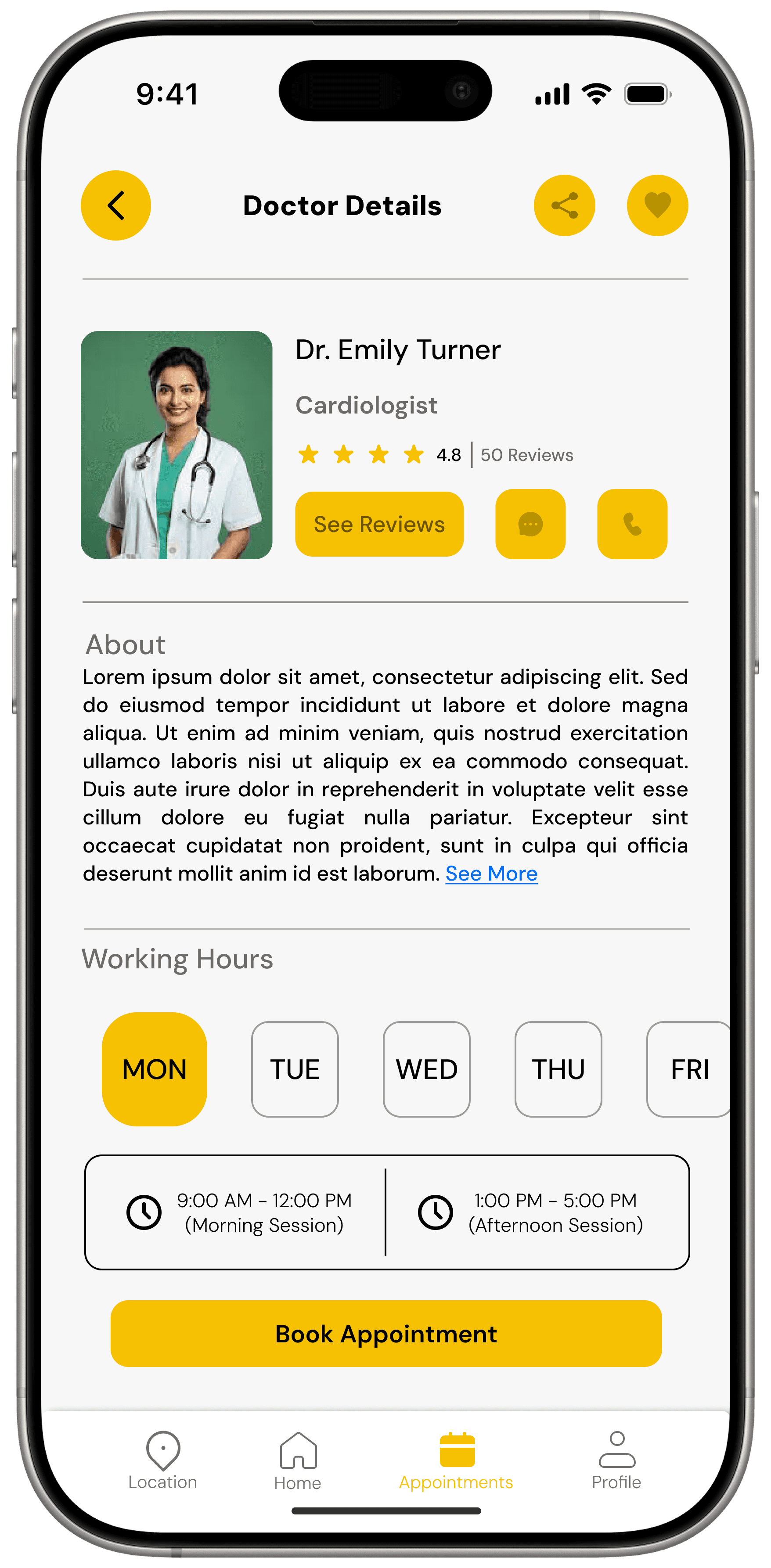
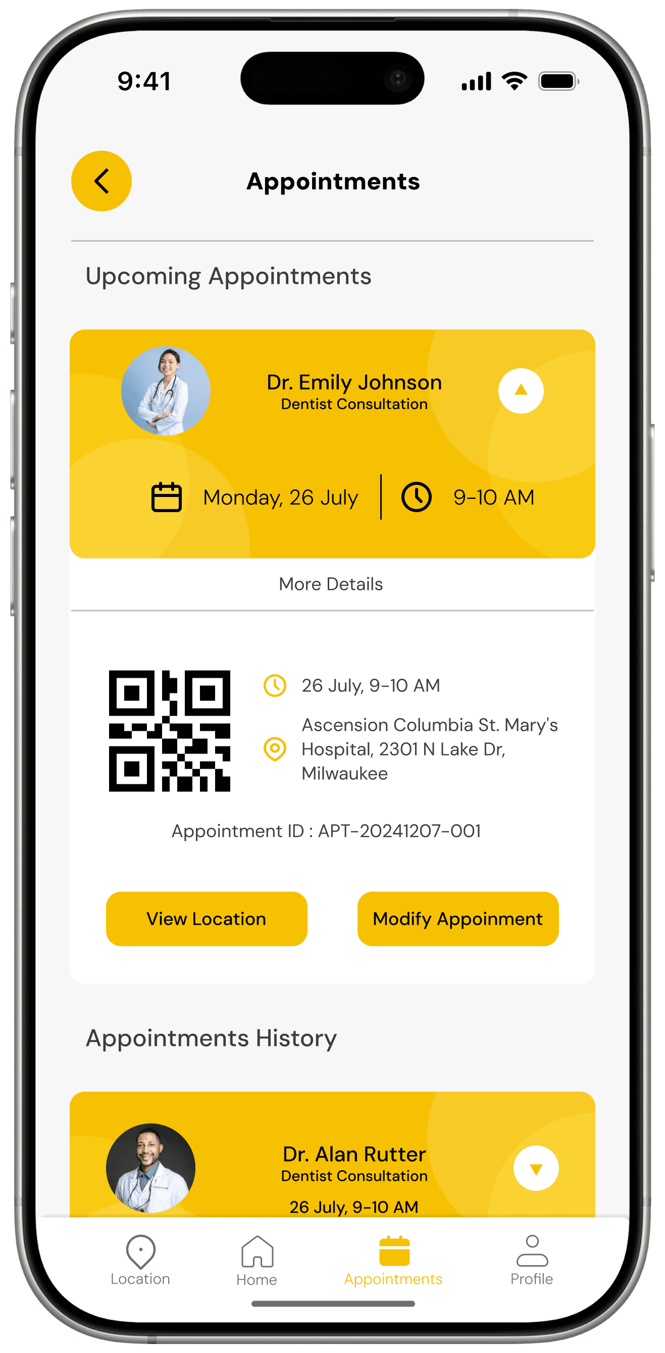
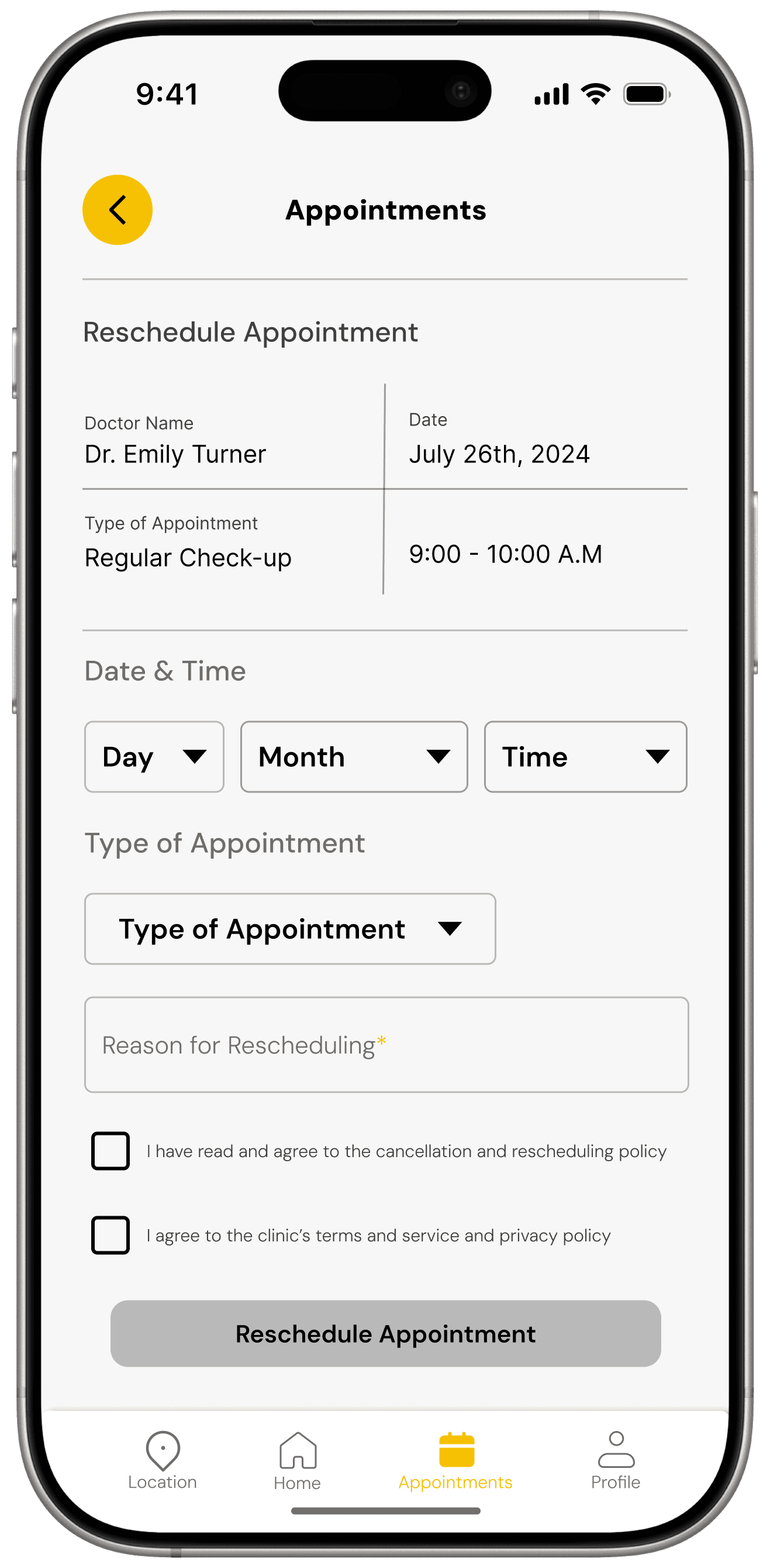
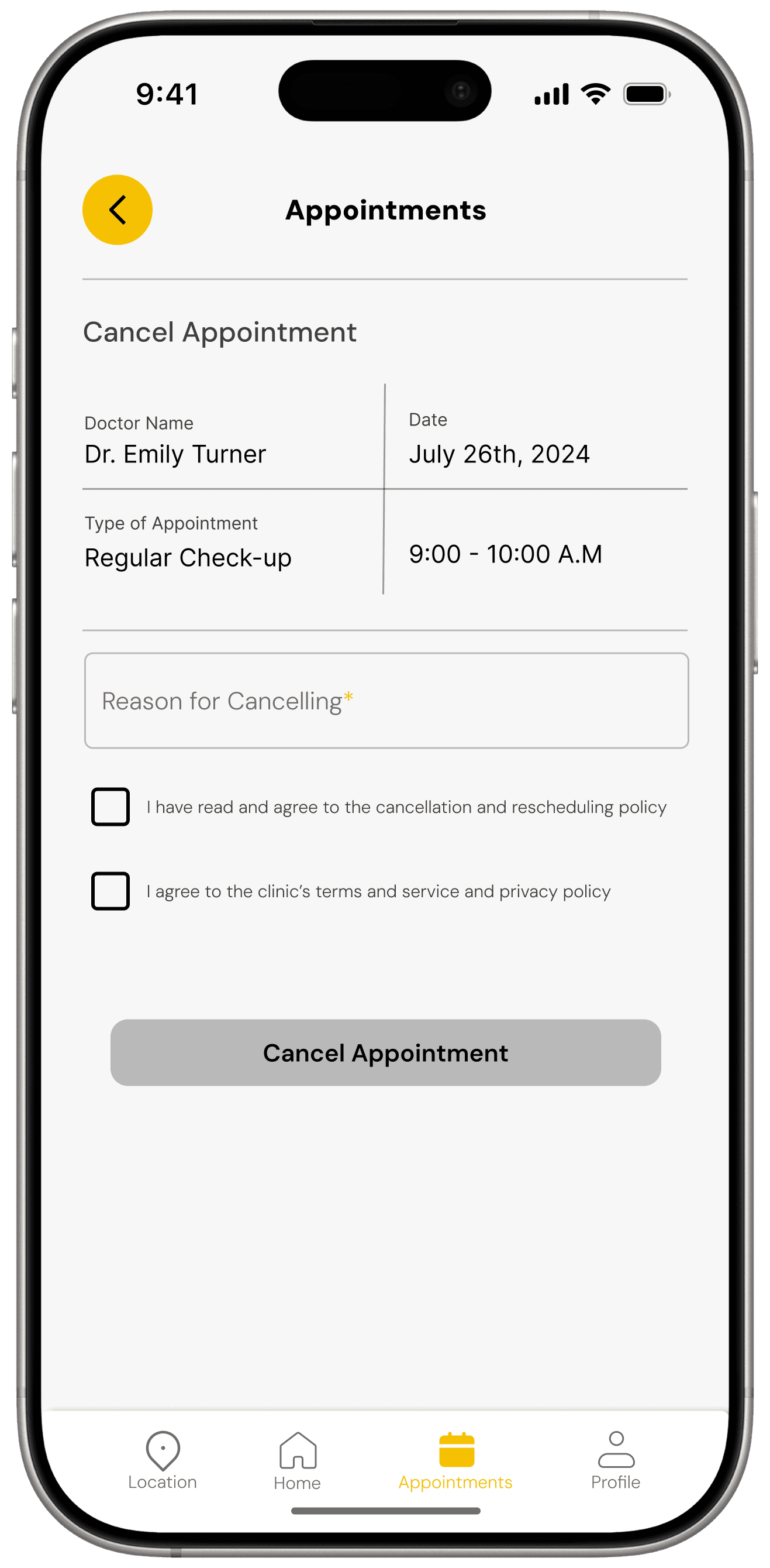
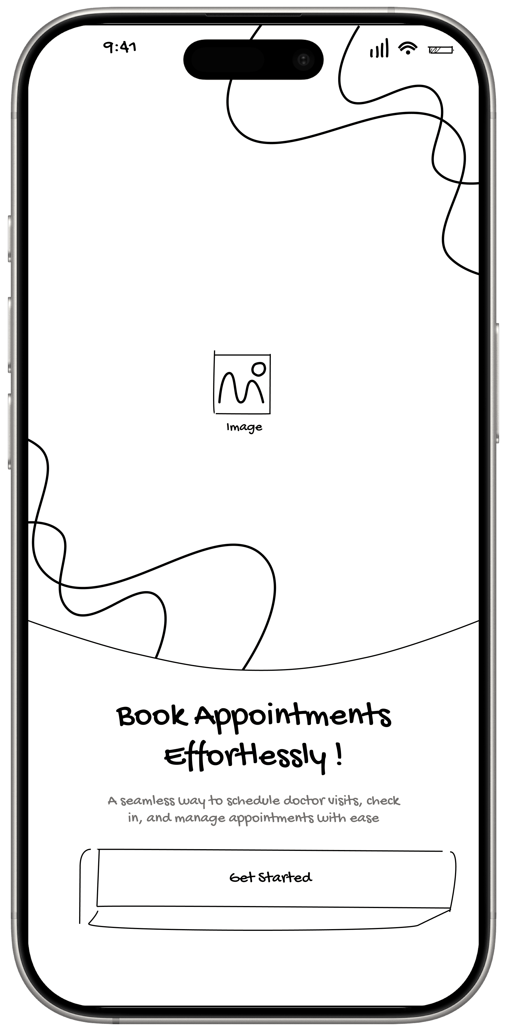
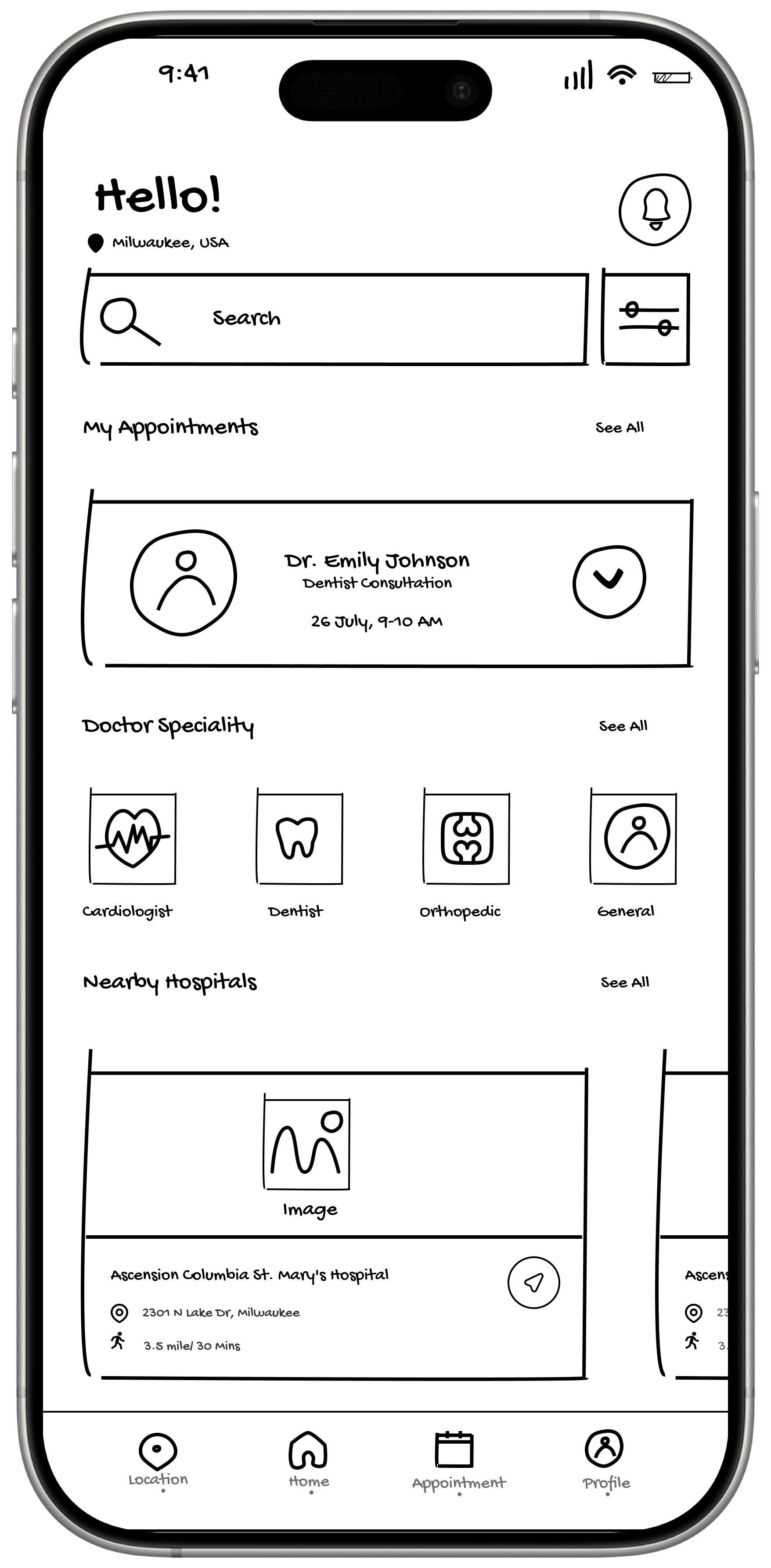
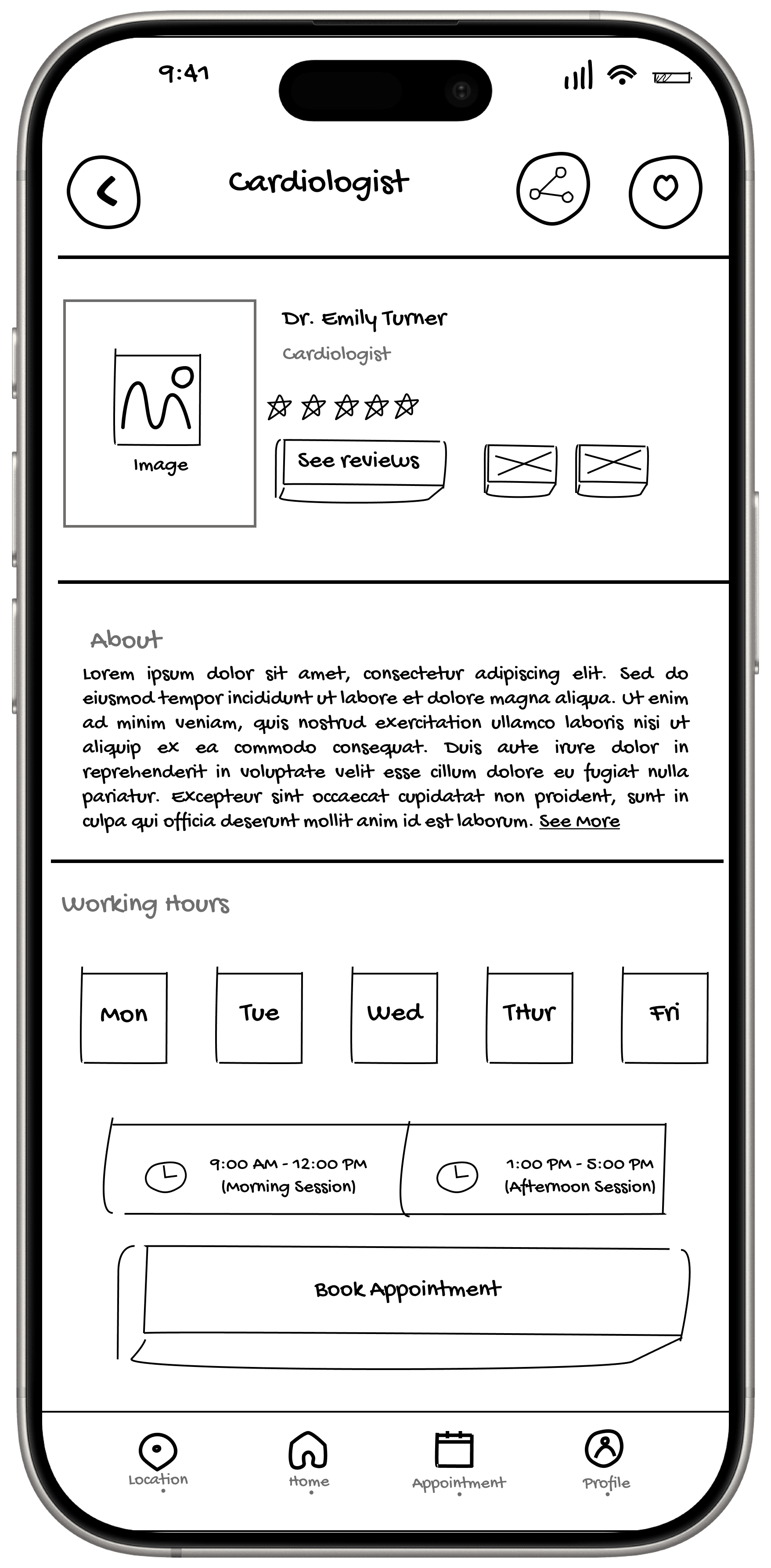
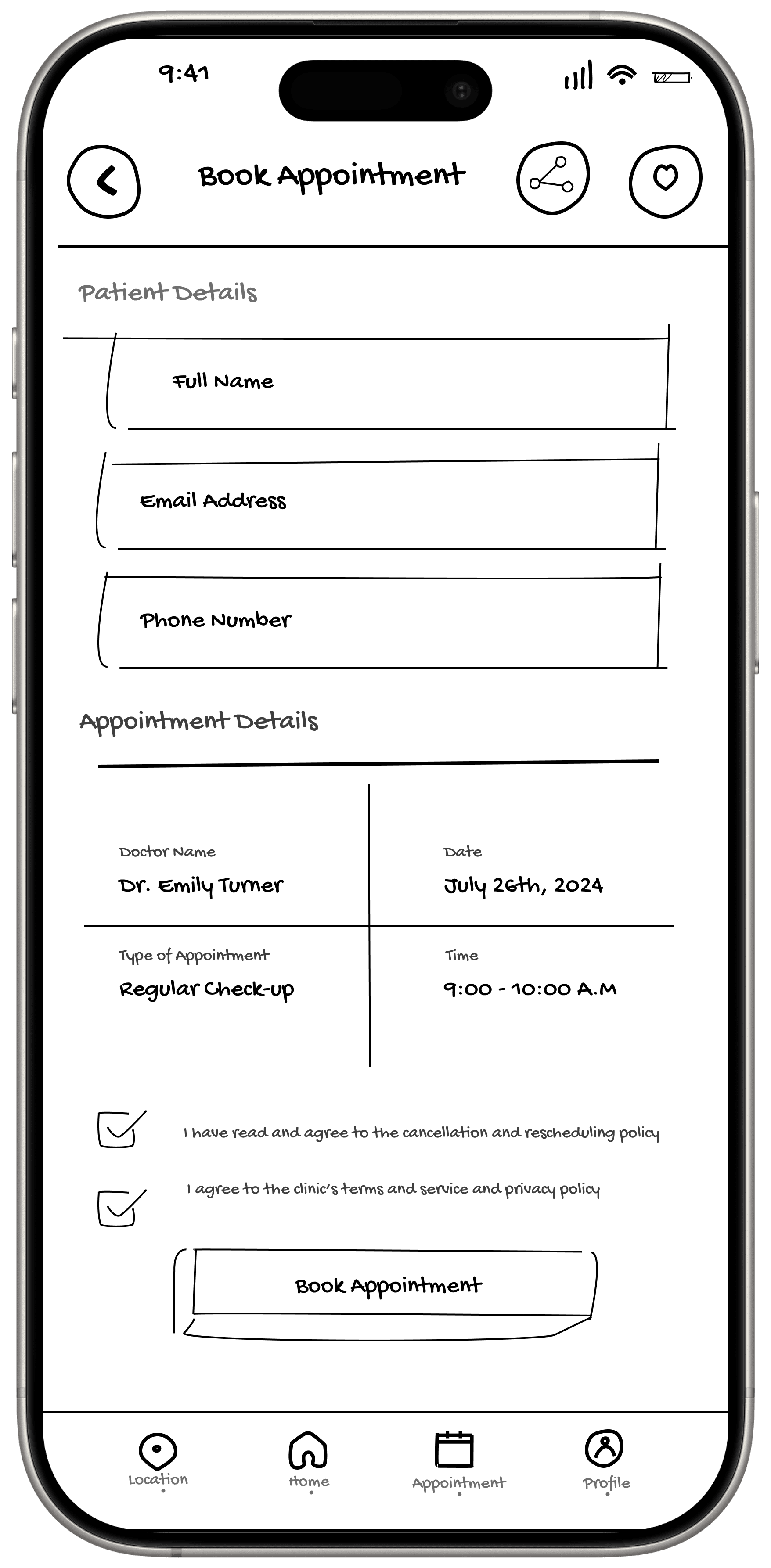
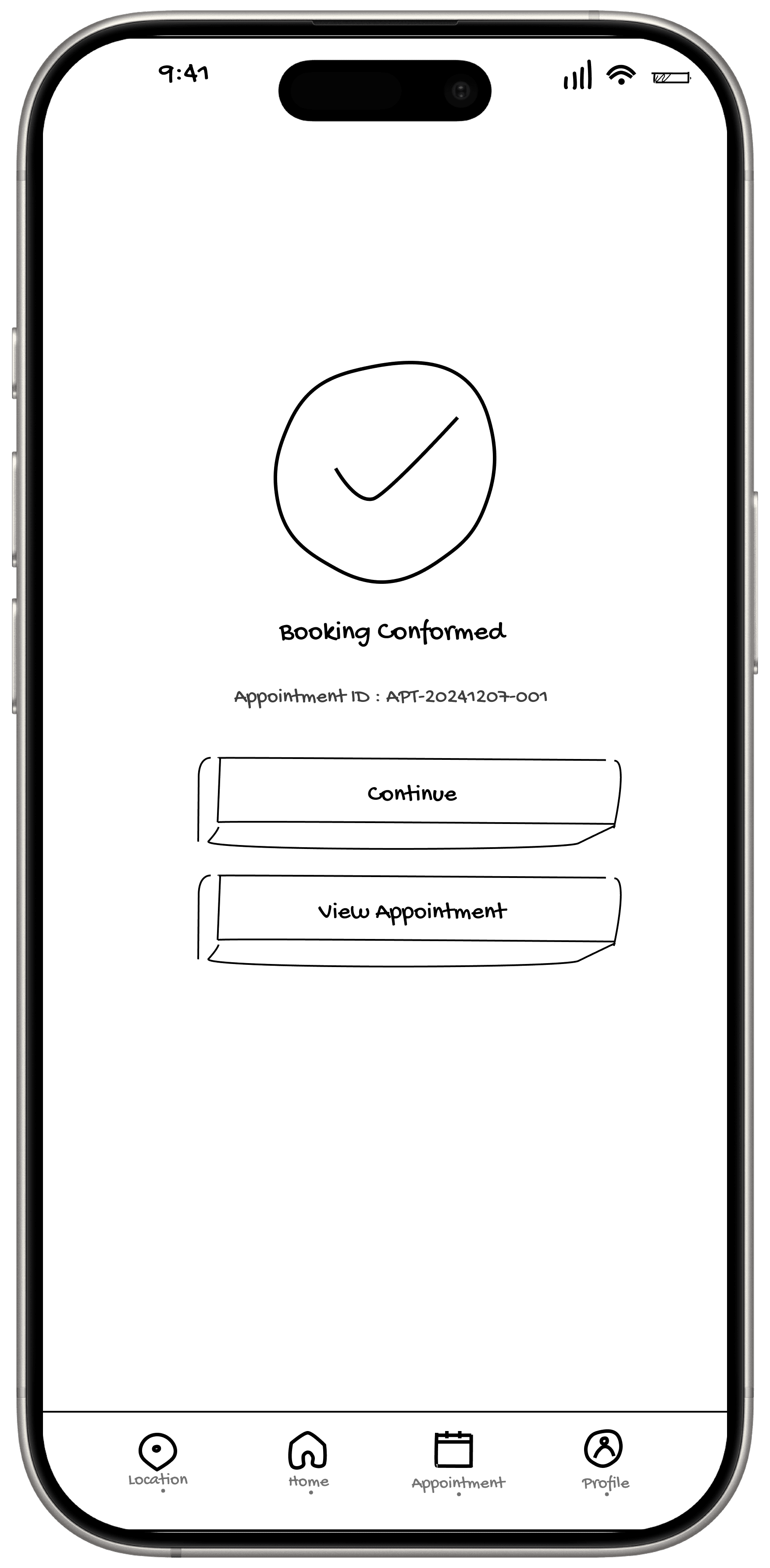
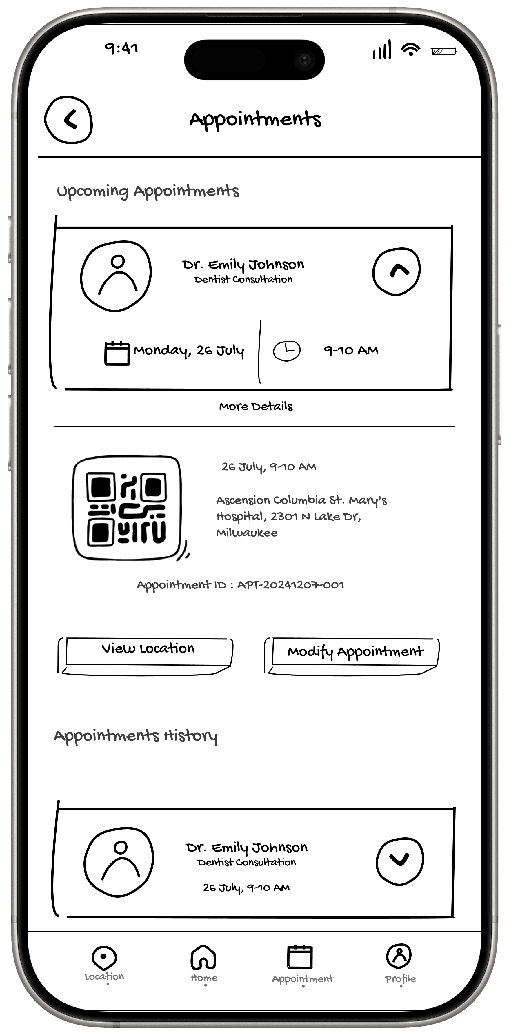
Wire Frames
Wire Frames
Wire Frames
Wire Frames
In the design phase, I focused on key features that would address the main concerns of our user personas. Based on user research, I designed high-fidelity screens to create a smooth and easy experience. These screens helped visualize the full user flow and set the foundation for prototyping.
In the design phase, I focused on key features that would address the main concerns of our user personas. Based on user research, I designed high-fidelity screens to create a smooth and easy experience. These screens helped visualize the full user flow and set the foundation for prototyping.
In the design phase, I focused on key features that would address the main concerns of our user personas. Based on user research, I designed high-fidelity screens to create a smooth and easy experience. These screens helped visualize the full user flow and set the foundation for prototyping.
In the design phase, I focused on key features that would address the main concerns of our user personas. Based on user research, I designed high-fidelity screens to create a smooth and easy experience. These screens helped visualize the full user flow and set the foundation for prototyping.


User Testing
User Testing
User Testing
User Testing
I developed a high-fidelity prototype and conducted an initial test with a small group of users. The goal was to observe how they interact with the app and identify areas that could be improved in terms of user experience and clarity.
Scenario:
The user opens the app to quickly book a doctor’s appointment. They want to check availability, ensure their information is accurate, and complete the booking without making a phone call.
Task 1:
Select a doctor and choose an available time slot.
Task 2:
Fill in patient details and proceed to confirm the appointment.
Task 3:
Complete the booking and explore options to cancel or reschedule.
This test helped me gather practical feedback on usability, flow clarity, and areas where additional support or refinement was needed.

"Everything felt smooth and quick. I liked how I could book without going through long menus or calls."
"Everything felt smooth and quick. I liked how I could book without going through long menus or calls."
"Everything felt smooth and quick. I liked how I could book without going through long menus or calls."

"It was easy to understand. I didn’t get stuck anywhere, and the steps were simple to follow."
"It was easy to understand. I didn’t get stuck anywhere, and the steps were simple to follow."
"It was easy to understand. I didn’t get stuck anywhere, and the steps were simple to follow."
"It was easy to understand. I didn’t get stuck anywhere, and the steps were simple to follow."

"The flow was clear, and it didn’t take more than a few taps to get things done."
"The flow was clear, and it didn’t take more than a few taps to get things done."
"The flow was clear, and it didn’t take more than a few taps to get things done."
What I learned ?
What I learned ?
What I learned ?
One of the biggest challenges for me was designing something in the healthcare space where users expect both clarity and trust. Since this was my first project I had to make sure the layout and flow felt intuitive.
It was also challenging to think from multiple user perspectives not just tech-savvy users like me but also those who might struggle with apps. Making something simple, yet useful, took a lot more thinking than I expected.
This project taught me the real value of user feedback. Even small comments during testing helped me improve the design in ways I wouldn’t have noticed on my own.
I also learned how important it is to stay focused on what users truly need not just what looks good the whole process helped me grow in how I approach
Overall, this was a great learning experience that helped me improve not just my design skills, but also my confidence in solving real-life problems through design.
Let's Connect
Let's Connect

Available for Internships and friendly feedback
Available for Internships and friendly feedback


Let's Connect
Saichandukandimalla@gmail.com